Pharmaceutical - HCP and Consumer facing Brand Identity
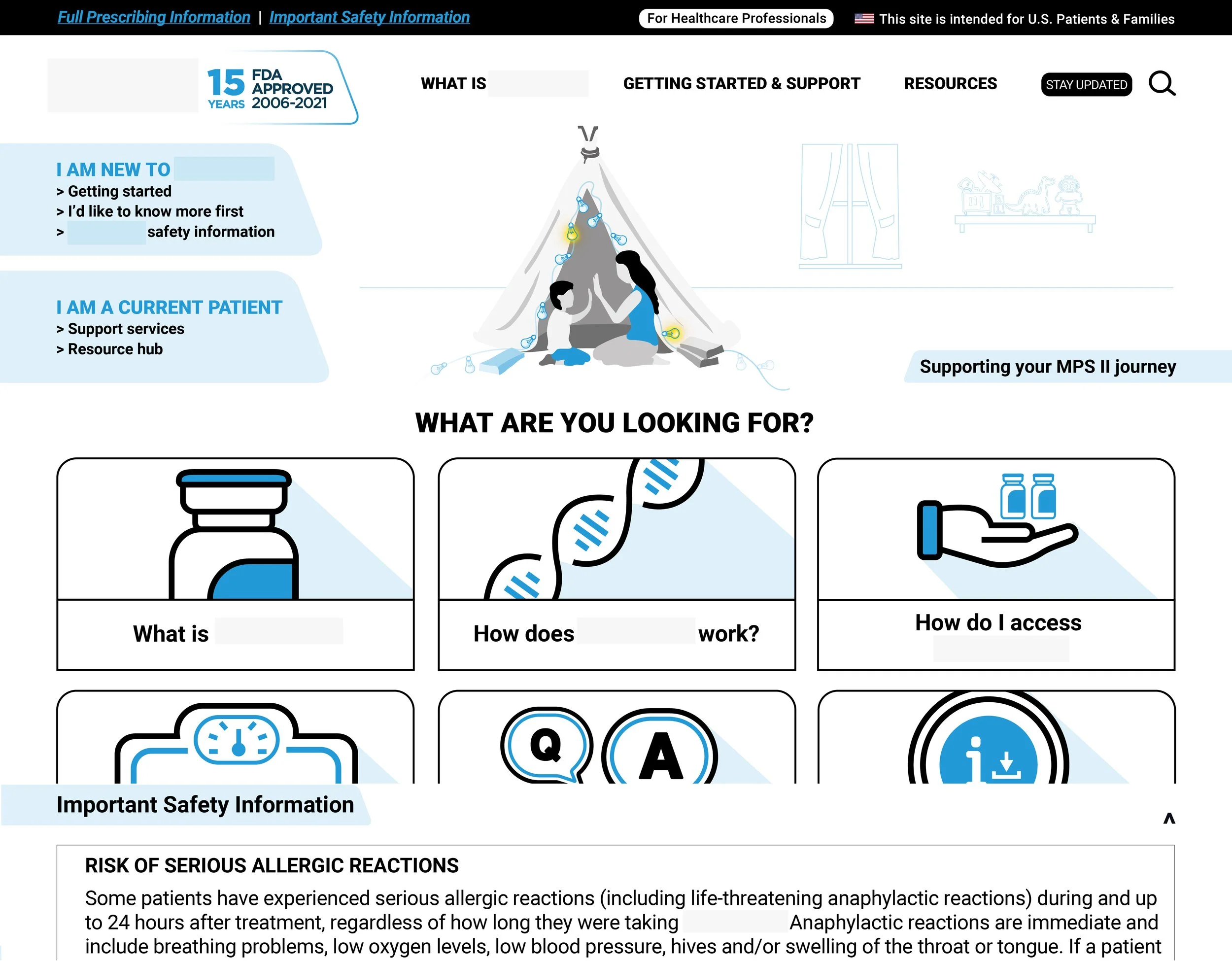
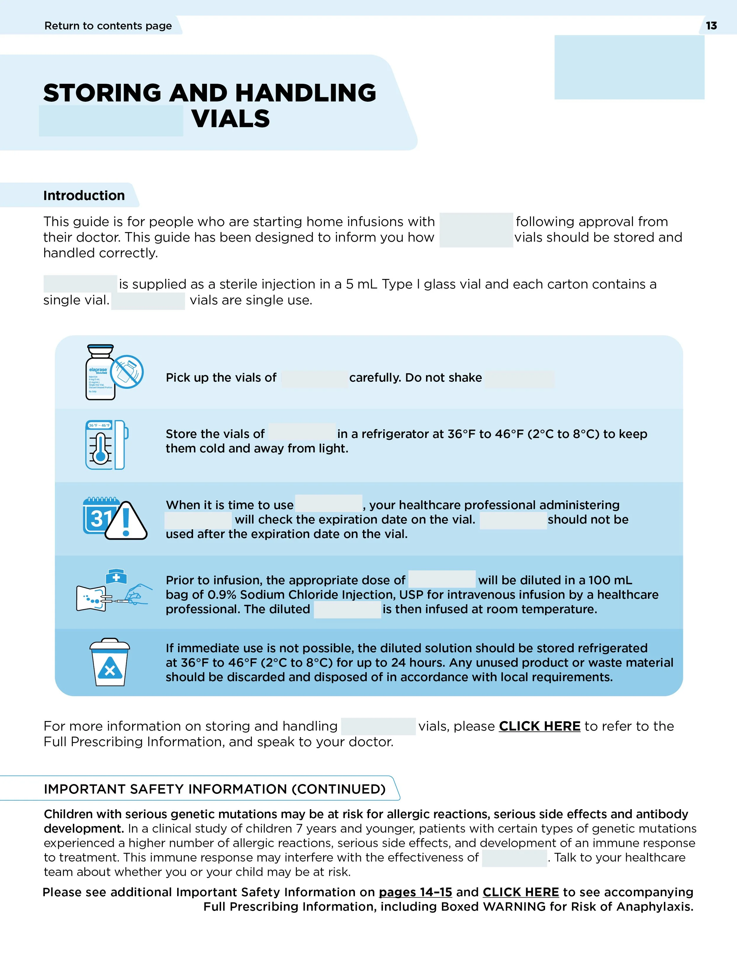
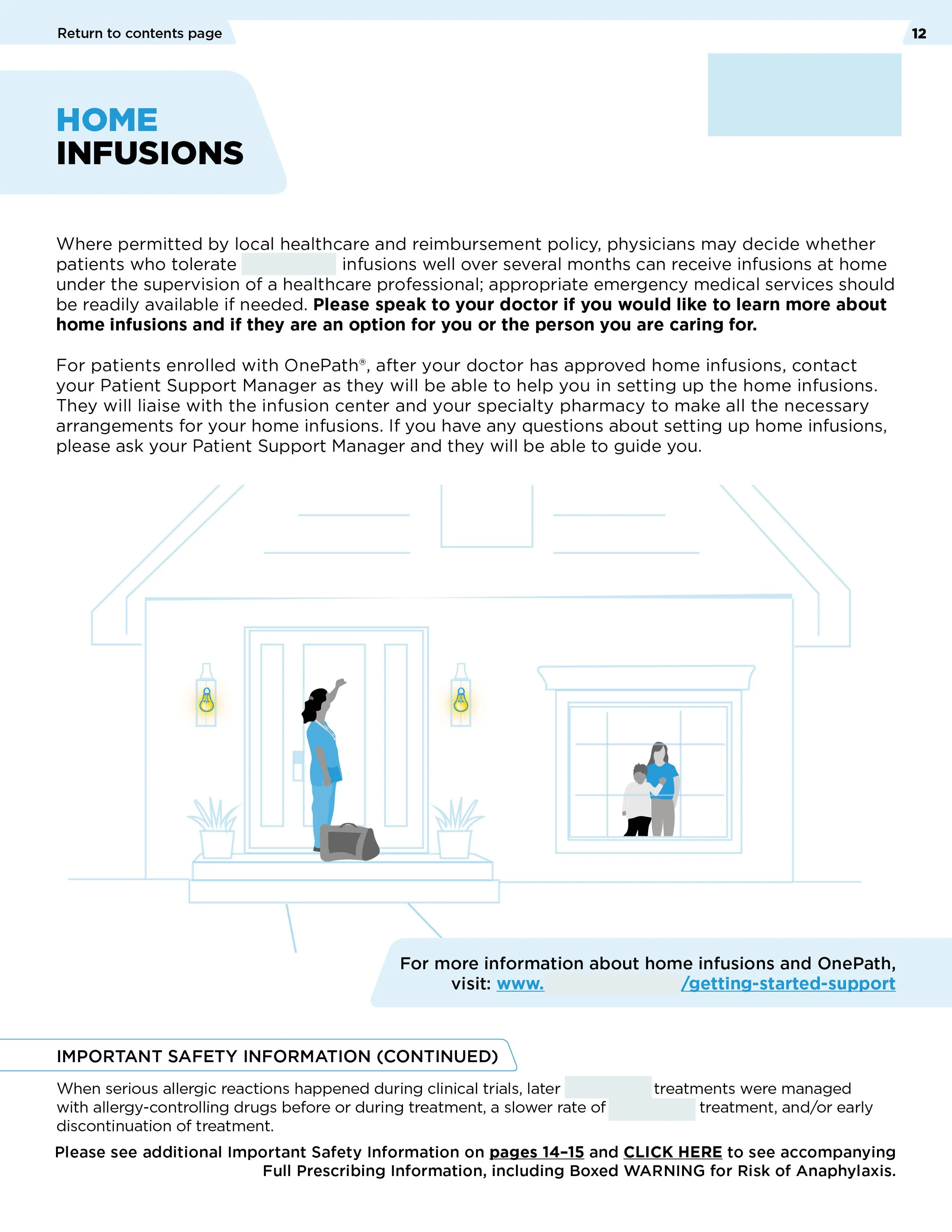
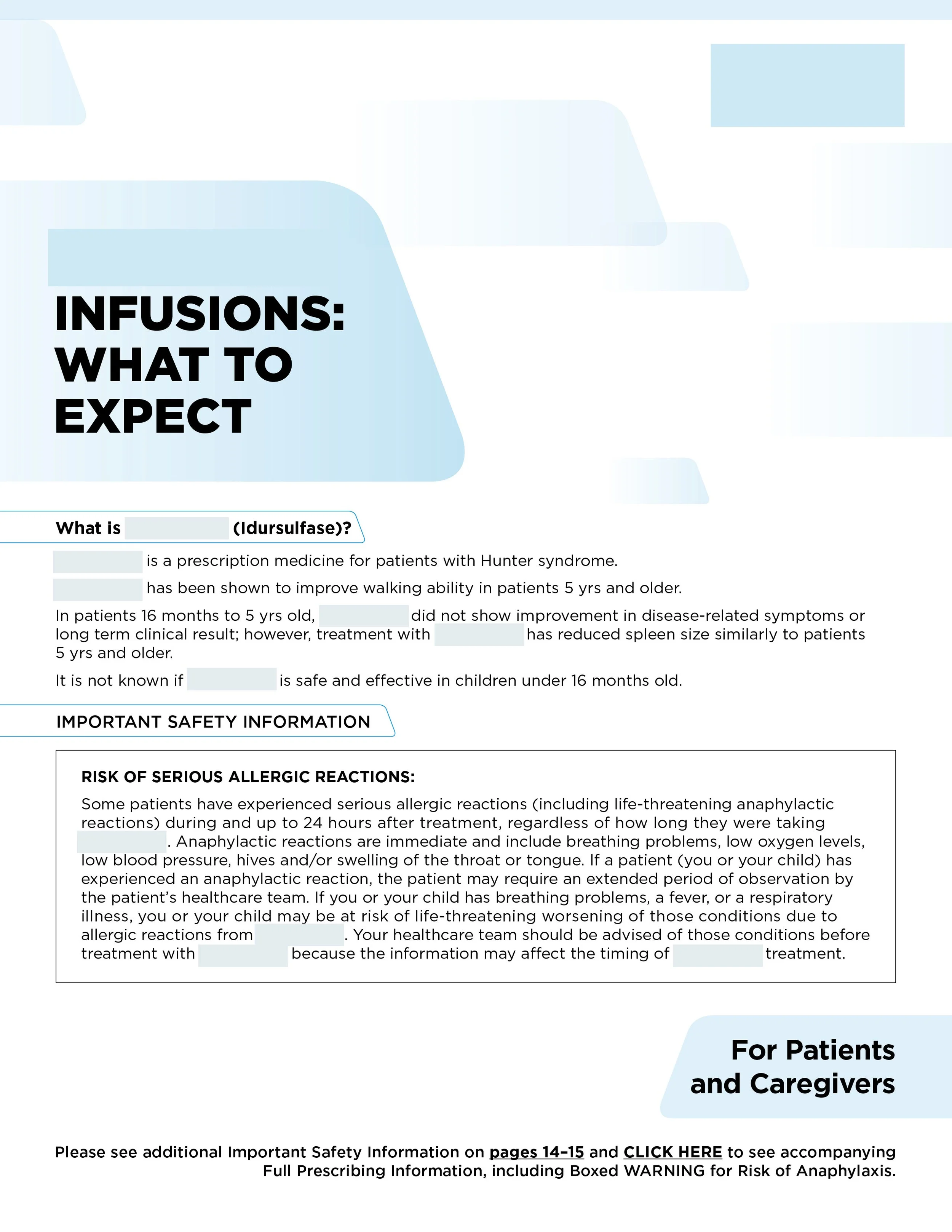
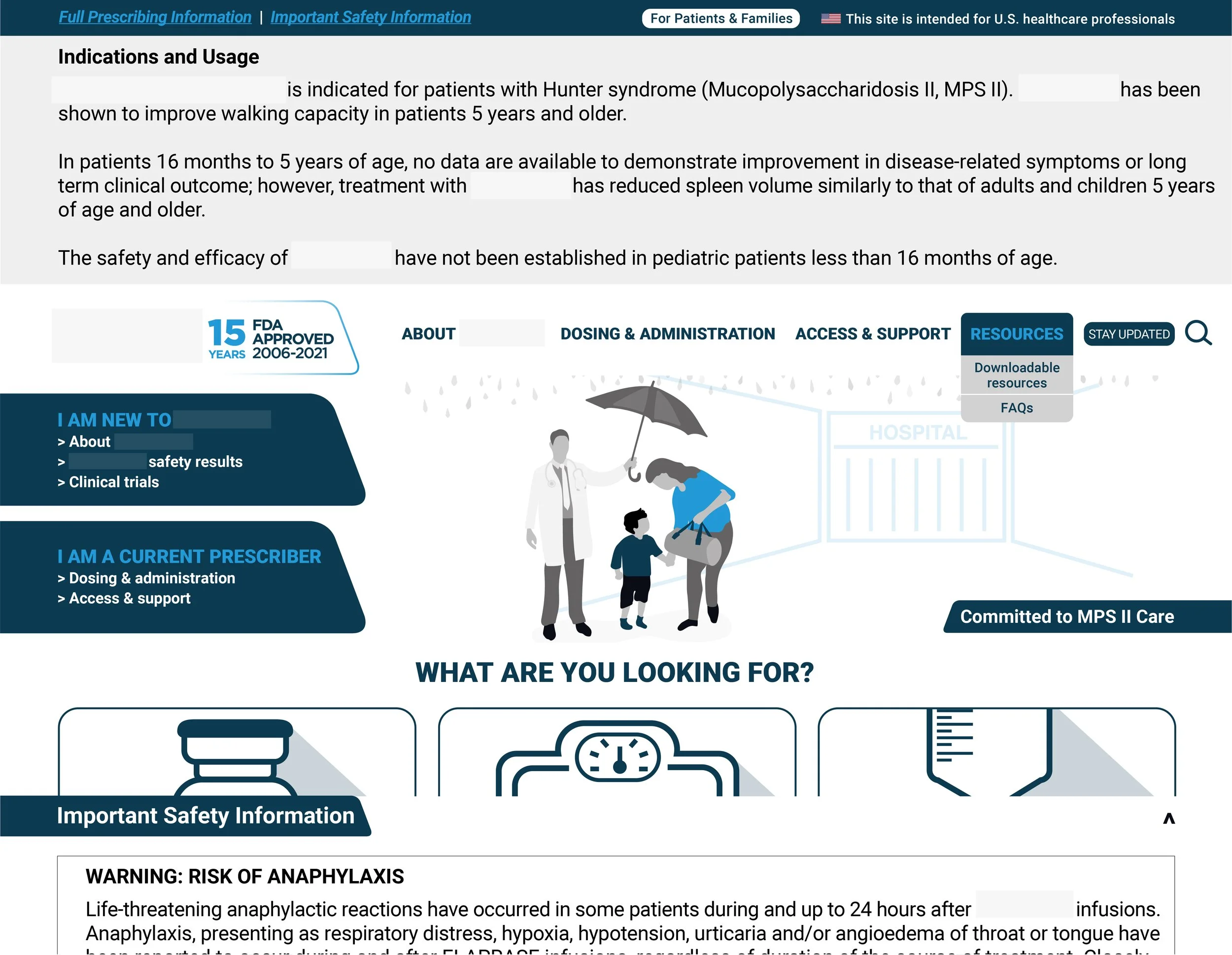
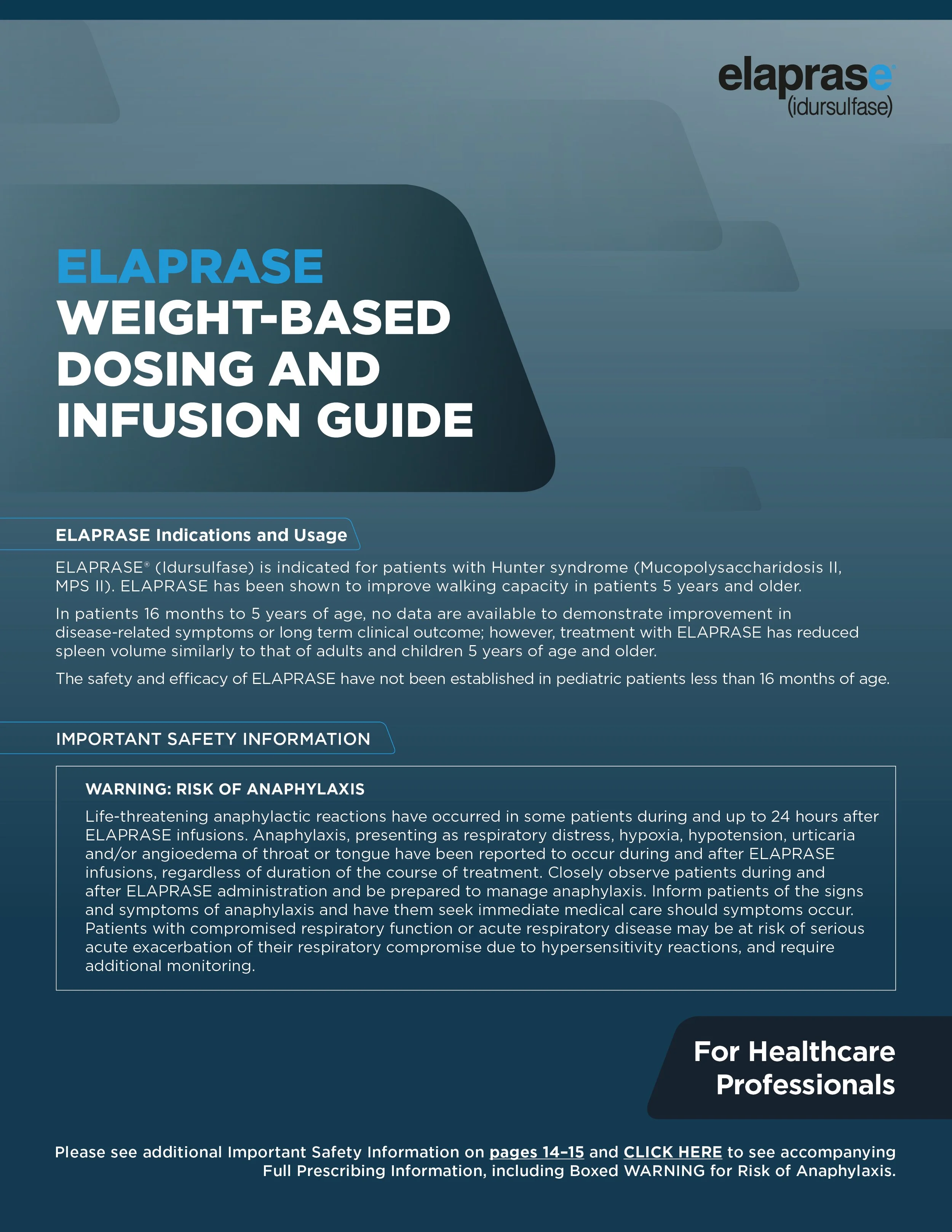
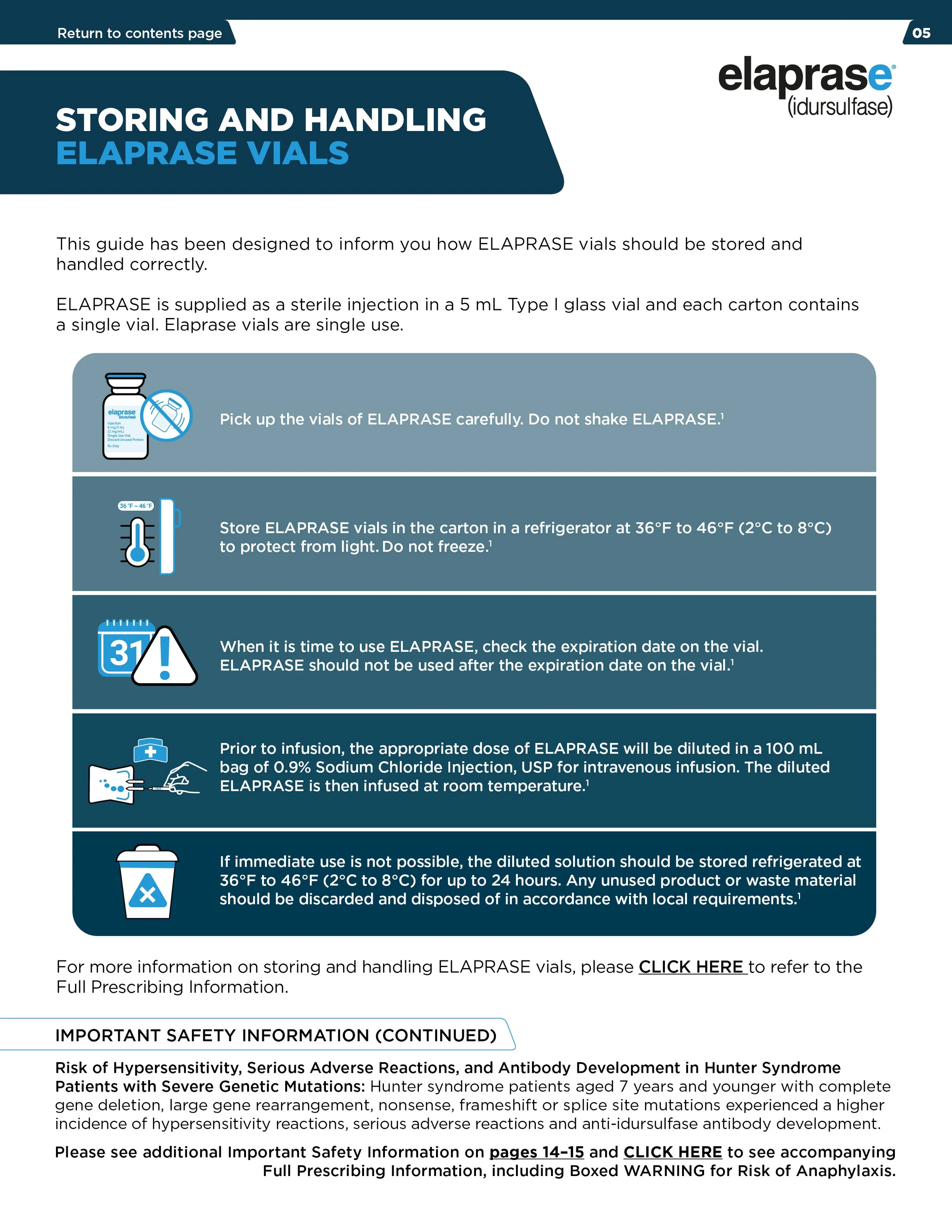
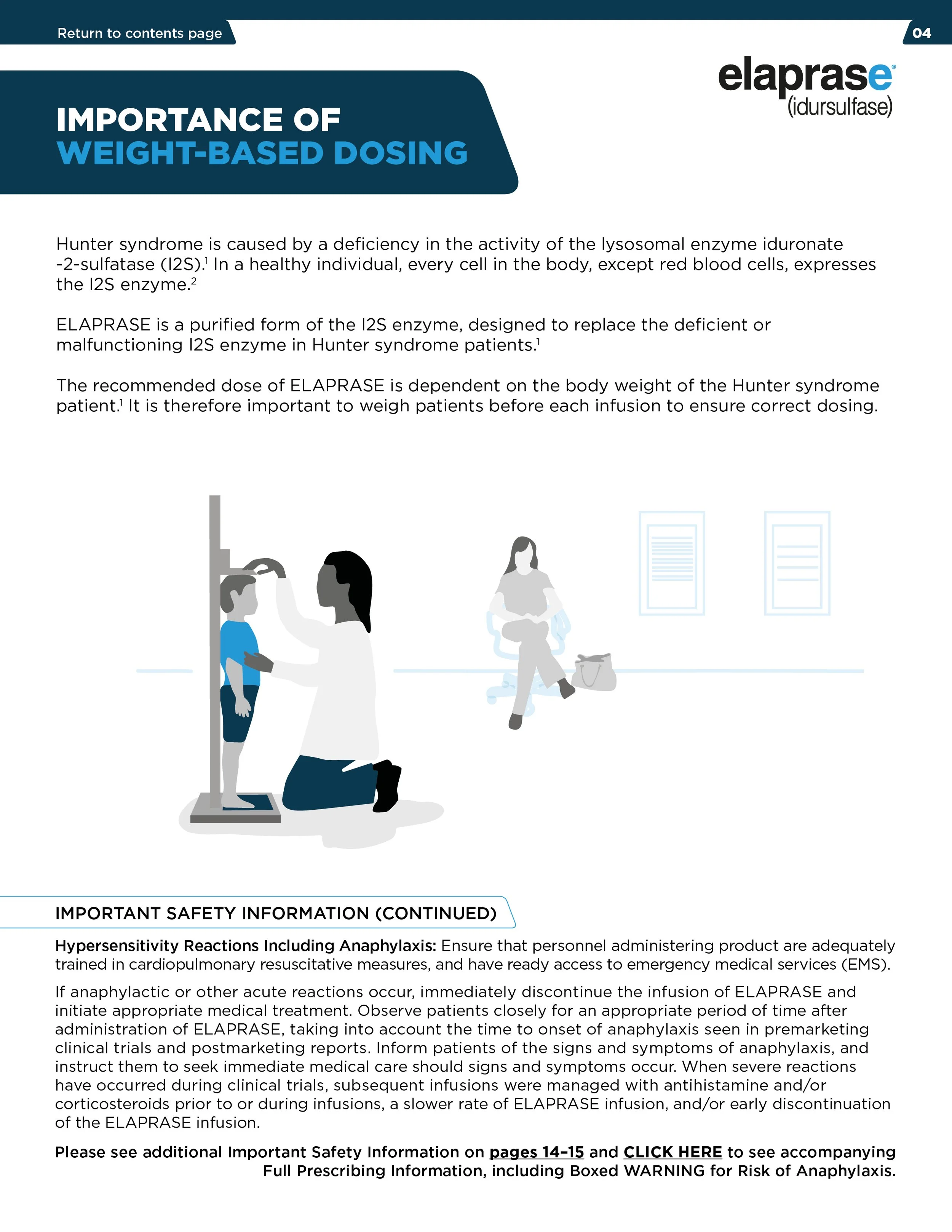
Here is a selection of work from a new brand identity campaign I created for a pharmaceutical, spanning both HCP- and Consumer-facing marketing materials. The challenge was to ensure the two audiences had clearly distinct visual identities, while still feeling part of the same overarching brand. I achieved this through a defined colour system, using dark blue for HCP communications and a lighter blue for consumer materials. I also developed a suite of bespoke illustrations to support the messaging and communicate information in a clear and engaging way.
Note: Certain sections have been redacted due to sensitive medical information.
HCP (Healthcare Professional) facing.

Consumer facing.